WNBA Concepts, Jun–Nov 2025


Atlanta Dream
The actual logo is meant to incorporate a basketball, a phoenix, and a shooting star.
I tried to make the phoenix silhouette a bit more obvious with a tan-colored outline. Plus, since the team is named after Dr Martin Luther King Jr., I integrated the Ebenezer Baptist Church that he pastored, too.
Along the same lines, I also made a "Red Hills of Georgia" peace sign basketball alternate logo.
The real life jerseys are super plain, with an extremely subtle reference to an art piece inside the National Center for Civil and Human Rights museum, but I switched to side paneling based on the actual building itself.

Charlotte Sting
Wanted to try a take on the Charlotte Sting name but with a more distinct brand from their NBA counterparts.
For the logo, since Charlotte is a banking city, a bank vault forms the roundel, with an agent inside wearing my attempt at a Charlotte crown / fedora combination.
The jersey is supposed to look like the Mint Museum Uptown.

Chicago Sky
Chicago comes with a logo edit and jersey design that incorporates the Chicago Theater marquee sign.

Cleveland Rockers
I went with a heavy music theming for the Rockers, since I've gotten into hardcore punk and metal over the last few years, and couldn't help but be inspired!
Overall, I just tried to combine the original Rockers color scheme with the current Cavaliers colors by using denim and buffalo plaid patches.

Connecticut Sun
I kinda struggled with ideas for Connecticut, since their logo is so solid as it is.
I just used the inaugural 2003 logo as a collar and shorts effect, and moved the Mohegan Tribe logo pattern from the current jersey sleeves to be stars. After the sale happens, those could probably just be four pointed stars instead. I added pink since the league's kinda missing it right now, and I want the Sun to look less like a New York team.

Dallas Wings
The side panel striping and primary logo are based on the Reunion Tower, with sleeve/collar trim based on the Bank of America Plaza building at night that's big and bright, with neon-inspired numbers to call back to the team's Pegasus namesake.

Detroit Shock
The announced return to Detroit, as usual for me, brings a familiar name with a new identity.
I went for a neon aesthetic, and depicted a shock absorber snapping from the shock — this way, each Detroit basketball team can have its own car part.
I additionally reference the Spirit of Detroit statue's glowing orb. The alternate logo is my attempt to improve the Pistons' awkward 313 Basketball logo.

Golden State Valkyries
The new Golden State Valkyries logo is apparently supposed to look like a sword and the Bay Bridge, but it's not reading that way to me, so I tried to make those elements more obvious.
I also thought the new jerseys were extremely boring so I just started from scratch here, introducing Warriors blue in place of black, and using gradient V's à la 2014 Germany and chainmail armor side panels.

Houston Comets
Here's the return of the original dynasty, while I eagerly await my hometown Storm to break the tie and fully surpass them in championship count 😈
My HC monogram logo is inspired by the original alternate logo. As for the jerseys, they're very loosely based on the '90s set, but I love a Houston tequila sunrise, so here we are.

Indiana Fever
The wordmark is nice but otherwise they have a very generic logo, which I tried to spice up a tiny bit with the firework/starburst from the state flag and a drop-shadow. The team also gets an alternate basketball logo with the Indianapolis city flag crossroad design.
Speaking of that nice script, it goes front and center on a jersey meant to combine the current look (the trim striping and name/number font) with the 2007 jersey (the pinstripe side panels and script wordmark.) The team never had an Indiana script wordmark, so I threw one together with the Gentamas font.

Las Vegas Aces
Personally I really dislike the Aces logo... I can't quite tell why, but I think it's the awkwardness of its LV monogram? Anyways, I attempt to spice it up, as inspired by the Las Vegas Lights logo and Mark Crosby's Raiders concept, which both use the Welcome to Fabulous Las Vegas sign.
I went with a warm gray to split the gold-silver difference of the team's two color scheme eras. The jerseys are based on the team's first third jersey, but integrates the design of the Oscar's Neon Martini neon sign, and switches the diamond pattern to a full playing card set.

Los Angeles Sparks
After their most recent update, the Sparks have the best logo in the league... I can't improve on that so I just did a uniform concept.
Not that this uniform set is an improvement on the real thing either, since the Palm Tree is already so nicely integrated into the wordmark already, but I thought it would be fun to experiment with fronds as an underline. The side panel sparks from the 2007 jerseys return.

Minnesota Lynx
I really prefer the front facing alternate logo that Minnesota has, so I just reworked the primary around that, and added an aurora and the Stone Arch Bridge.
The jerseys just showcase a repeated aurora / fur pattern, and introduce a retro-inspired arc design to the modern wordmark.

New York Liberty
For New York, I'm keeping the primary logo, but I created a new alternate logo of a balling Statue of Liberty.
For the jerseys I just ripped the Mets logo skyline, because it works so well and I didn't feel like making my own.

Philadelphia Rage
I recently found out about the old ABL name, and finally came up with an idea for it based on the famous Philadelphia LOVE sign.
The side paneling has a design based on the shape of the Liberty Bell crack, combined with a barbed wire pattern.

Phoenix Mercury

Here's Phoenix with a new thermometer alternate logo that also is the basis of my jersey side panels.

Portland Fire
With the news that Portland has re-copyrighted the Fire name, I wanted to do my take on a Florian cross logo idea for them by @edjb93 (whose excellent WNBA series has been an inspiration for this one!) especially since the Chicago Fire's logo doesn't really read as much of a Florian cross anymore... But I integrated the Portland flag and the team's establishment and re-establishment dates.
The primary jersey set goes for a firefighter stripe design, with a modernized version of the wordmarks from the original designs.

Sacramento Monarchs
I think it's an unpopular opinion but I dislike the very dated old Monarchs logo, so I kept a couple of basic elements and threw away the rest in favor of matching the current Kings branding. I switched to plum just to get some distance from the other California teams' purples.
Nothing too fancy for the jerseys; I just used the Kings' old checkerboards since the men don't seem to want it for whatever reason.
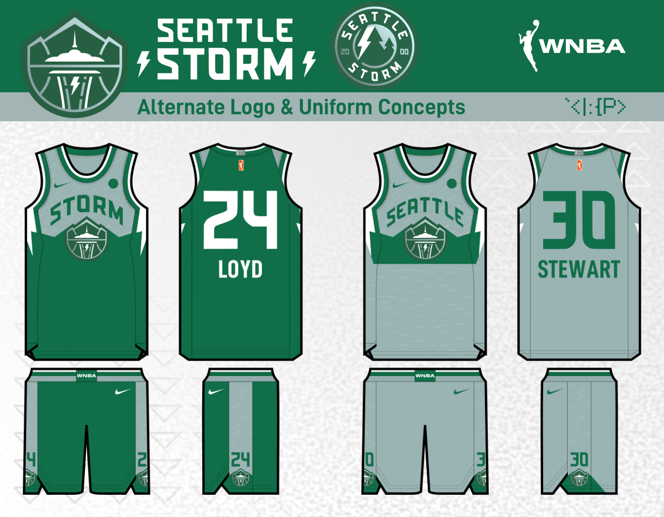
Seattle Storm
I feel pretty good about my Storm concept from 2021, so no changes, except I've added a new roundel alternate logo.

Toronto Tempo
For the new Toronto team, the name they came up with sounds very lively, but the logo and cold color scheme doesn't quite match that, so I've made a new primary logo, a font change, and some tweaks to the now demoted alternate logo.

Washington Mystics
I decided to cannibalize the defunct D-League Dakota Wizards affiliates logo to create a psychic High Priestess card from tarot. I also added a wordmark in a containing shape based on the current Mystics logo.
The jersey set is designed to let the away jersey be a vaguely 1997-inspired fauxback in the old blue and gold, but keeps red as the primary home color. I've added the Capitol Rotunda to the top section and a ouija planchette container for the numbers.